 "MLGCarGuy" (thejdmguy)
06/01/2015 at 20:39 • Filed to: None
 4
4
 9
9|
"MLGCarGuy" (thejdmguy)
06/01/2015 at 20:39 • Filed to: None | 4
| 9 |
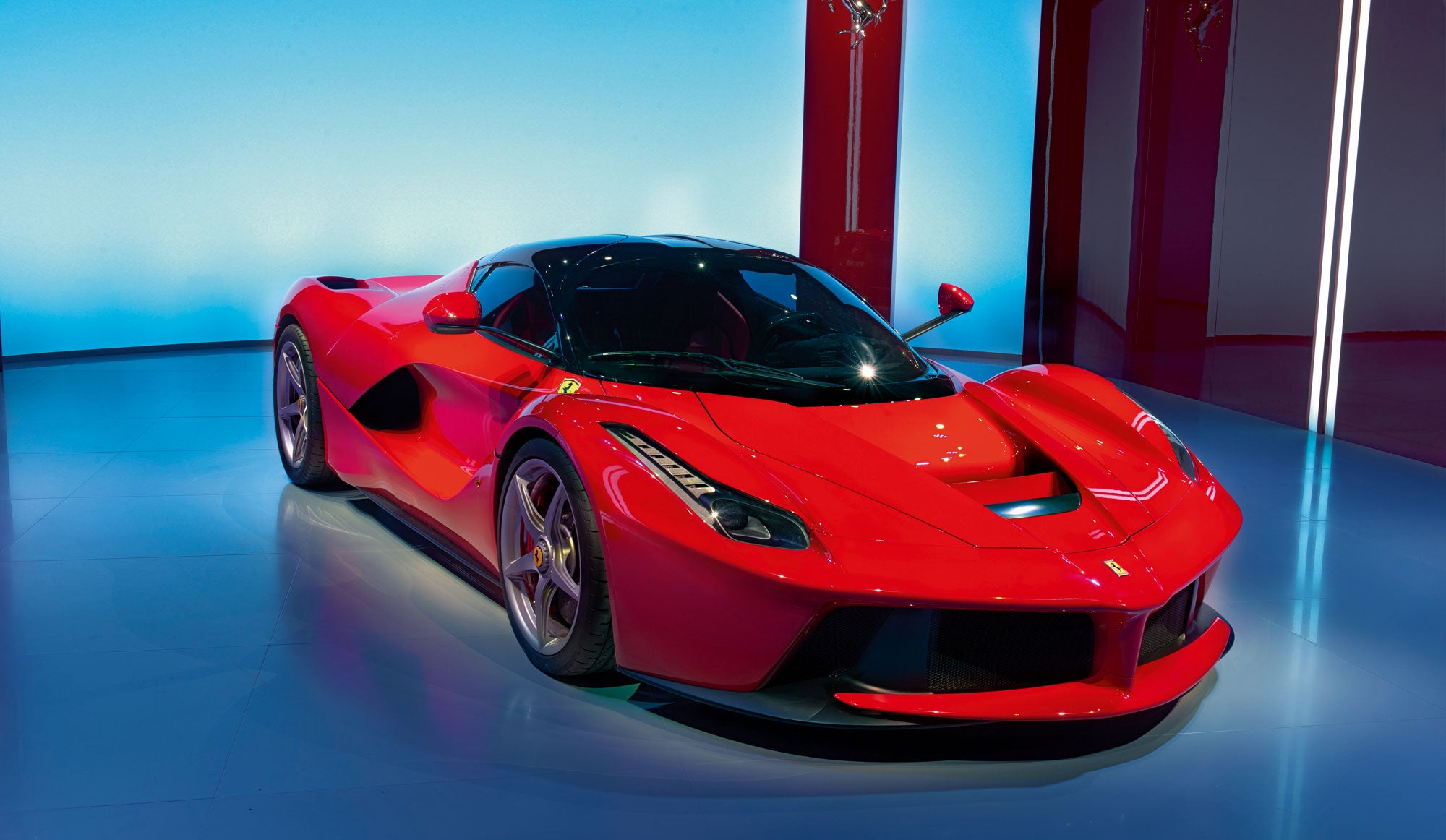
When certain cars don’t have parts in contrast paint/CF.
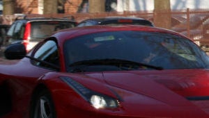
That LaFerrari above? It looks fantastic with a black/CF roof. And then there’s this failure:
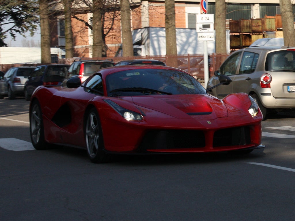
With a painted roof it looks like a failed 458 Italia project car.
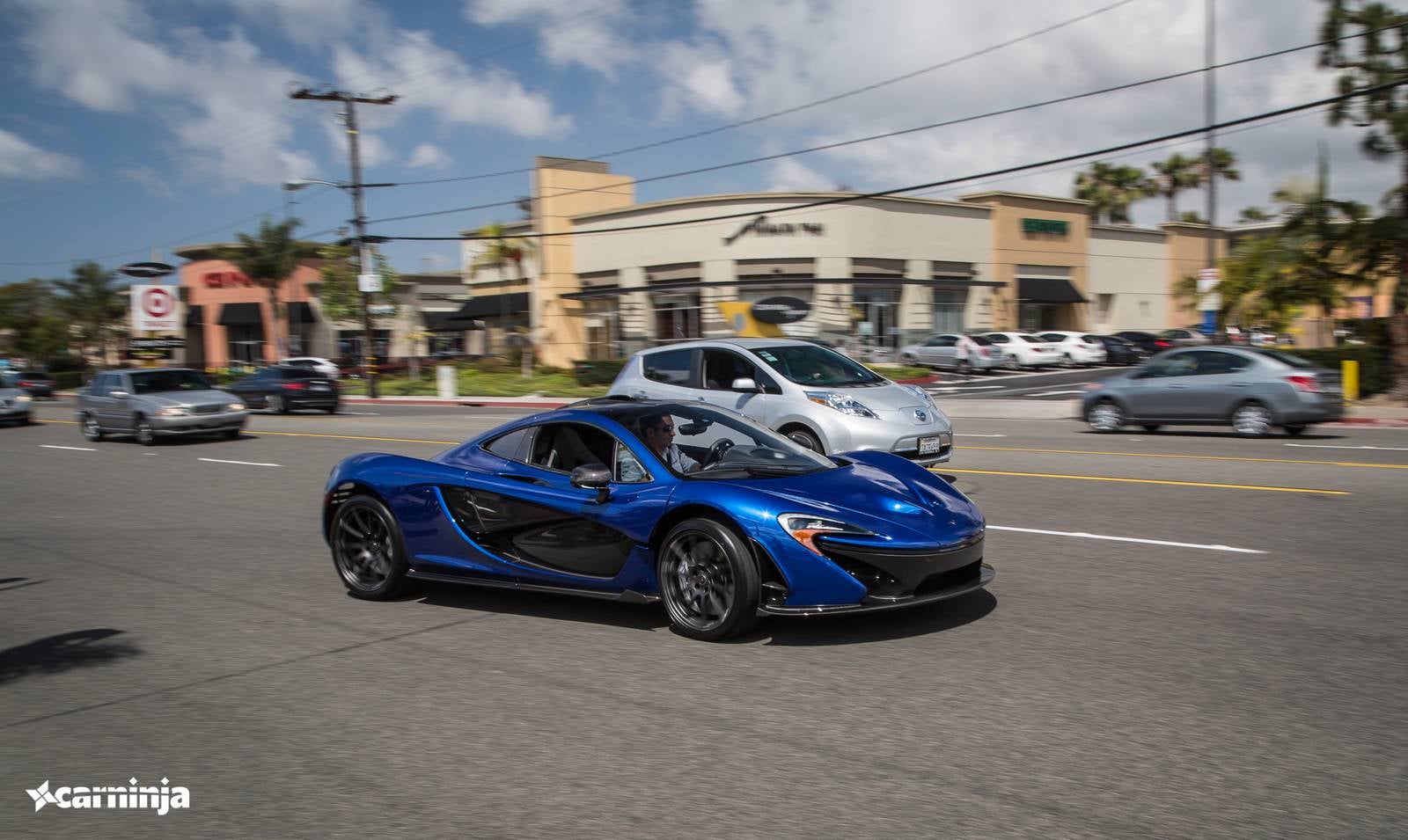
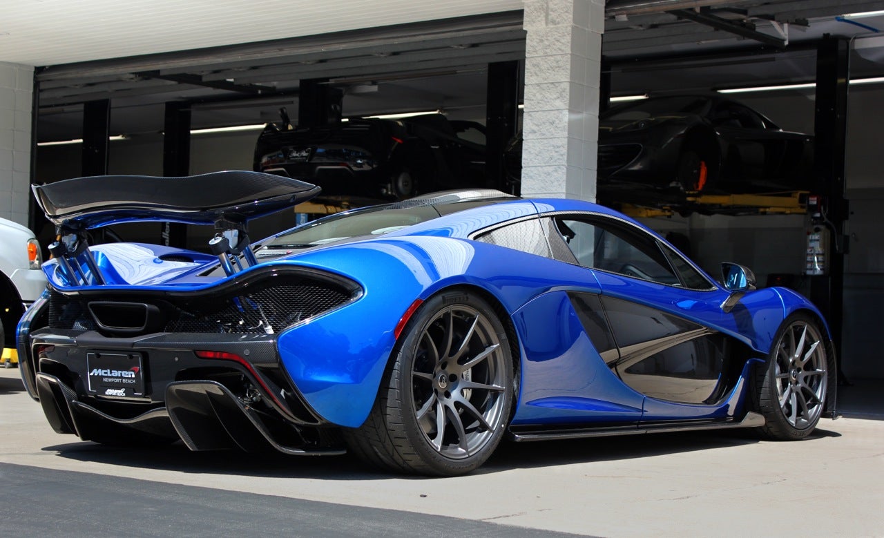
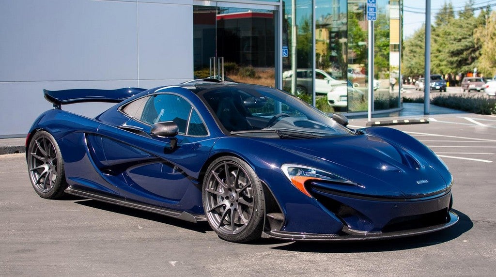
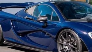
See this P1? It looks fantastic.
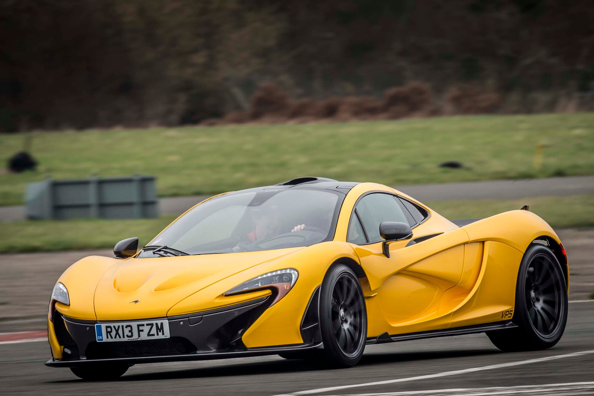
And then there are the ones with no two-tone.
To me that’s not right.
Got any other cars that seem like this?
 Alex B
> MLGCarGuy
Alex B
> MLGCarGuy
06/01/2015 at 20:41 |
|
Wow, the LaFerrari without the contrasting roof does look awful!
 AM
> MLGCarGuy
AM
> MLGCarGuy
06/01/2015 at 20:44 |
|
This looks horrible. I’d even say it’s ugly in this form.
 norskracer98-ExploringTheOutback
> MLGCarGuy
norskracer98-ExploringTheOutback
> MLGCarGuy
06/01/2015 at 20:46 |
|
I actually like the solid colour P1.
|
MLGCarGuy
> norskracer98-ExploringTheOutback
06/01/2015 at 20:55 |
|
In dark colors it’s acceptable but in bright colors like yellow it’s really noticeable.
 Cherry_man1
> MLGCarGuy
Cherry_man1
> MLGCarGuy
06/01/2015 at 21:07 |
|
Now the P1’s don’t look that bad.
|
MLGCarGuy
> Cherry_man1
06/01/2015 at 22:17 |
|
In those colors they aren’t. In this color it’s a bit more noticeable.
|
Cherry_man1
> MLGCarGuy
06/01/2015 at 22:35 |
|
On it’s plate I would have the word Lemon. IT LOOKS LIKE A BIG LEMON!
 Axial
> MLGCarGuy
Axial
> MLGCarGuy
06/02/2015 at 04:04 |
|
That’s why I think the 1990 ZR-1 looks better than the ‘91-’95; the black belt line brings the whole design together. It’s also why I don’t like the face-lifted Testarossa or 348.
 StndIbnz, Drives a MSRT8
> MLGCarGuy
StndIbnz, Drives a MSRT8
> MLGCarGuy
06/02/2015 at 09:39 |
|
wow, I’m surprised I actually don’t like that as much as the carbon 2 tone.